ShopDreamUp AI ArtDreamUp
Deviation Actions


Comments1
Join the community to add your comment. Already a deviant? Log In
Hello there!
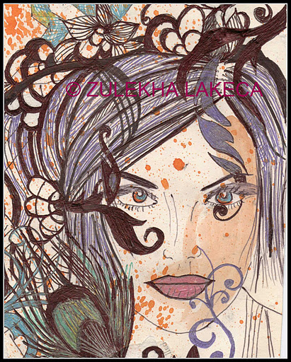
I love your choice of colours, and the decision to keep a sketchy quality about this with your mediums, however there are two issues which really stick out to me.
One, you have a mass of beautiful, intricate and intertwining detail in colour and in bold lines which skews the composition and makes it "hair" heavy for want of a better term - This can be okay, but because your hair has no distinct form of its own (it does not hold much compositional merit if you create "guidelines" following shapes or forms about, and they often lead off the page without intersecting), it makes the image look busy there, and meandering without narrating your story AKA the lovely and compelling visual portrait of a woman.
This is rather related to my next observation which is form. The image could benefit greatly from stronger sense of form and purpose - that is, create -definite- shapes out of those black, petal like objects, and make sure that they all appear consistently within the image. Be consistent about the shapes of feathers and hair lines almost to the point of creating vector-like images.
I love how you have chosen to stylise the face, and even with the spatterings of paint, she has this real alabaster-like quality because of the mass of colour around her. However, when stylising faces or any shapes it is really important to think of how they "read" to the viewer. So a nose may not be simply two strokes on either side and then some nostrils. You dont have to consider shadows and lights, but, you can define density with careful choice of which lines you select. Also, you will find your linework begins to look a lot more "finished" when you are selective in this manner.
Things like thick lines vs small lines are all important in your image. Thick lines will usually pull those objects into the foreground. I think it was your intention for the face to be the focal point. I personally would switch the thick lines into the face, and define the flora and feathers etc with more delicate lines.
Some nuance with your lines - say a thick line dwindling to thin where the object is more delicate etc will really make this shine.
Lovely work with the oranges in the eyes - they almost look molten, and the orange spatters almost look golden at times which I think is a wonder of your choice of colours. You definitely have vision and I think you should keep on with your art for sure!!! Good luck <img src="e.deviantart.net/emoticons/w/w…" width="15" height="15" alt="